Branding
Naming
My first step in branding for the project was to decide on a name.After some brainstorming, I decided on a name: Obtract.
The name comes from the roots of the words “obstruct” and “distract.” Ob-, meaning “against,” and -tract, meaning “drag or draw.” Because in a way, the project should push against the draw of distraction.
Also, it’s short, it sounds kind of like “subtract,” and the .com was free. The name was also seven letters, so it would be possible to get an SMS phone number that matched it.
Moodboard
I created a moodboard of some of the projects and concepts that I wanted to incorporate into the visual design.

Sources (from left to right, top to bottom):
- Feltron 2007 Annual Report
- Checklist
- Wooden Toys
- Longleat House Maze
- Top 10 Boutique Coffee Shops
- Elements of Style: My Office
- Nike+
- Wee Places
- George's Japanese Garden
- Mappiness
Strategy
I chose a few concepts that described the concept I was trying to communicate:
- A good obstacle
- Meditative/Zen-like
- Slow
- Measured and mindful
- Positive, not punishment
Logos and Icons
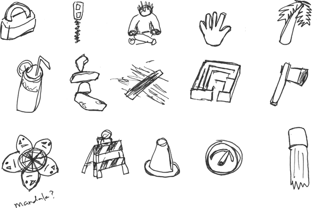
To decide on logo for the application, I made a series of sketches.
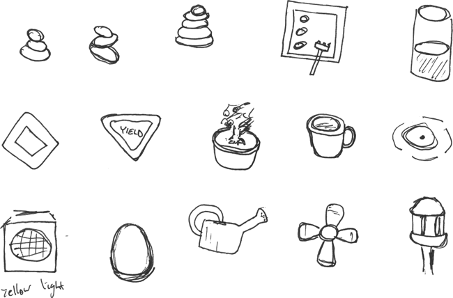
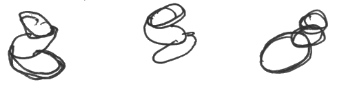
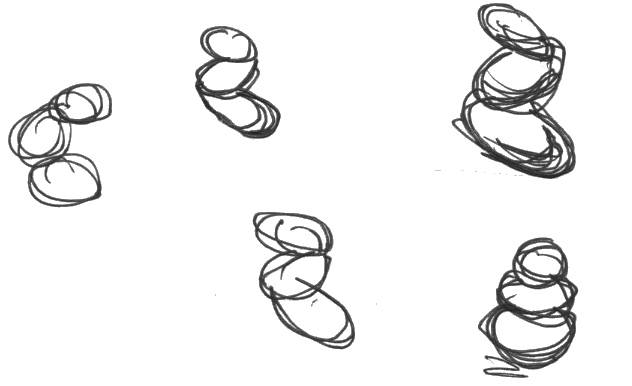
After polling my classmates, it seemed that the “three balancing stones” was the strongest. My classmate Kristin Graefe volunteered to help create an icon to try out the concept:
The concept of the stones didn't make it into the final prototype, so I decided to try something else that used the maze concept:
I sent this to designer Wes Gott, who revised it even further. (The word "Obtract" is actually hidden in the maze.)
He also suggested pairing it with the typeface Avant Garde.
Wes also sent a smaller version of the icon to be used where the large icon had too much detail.
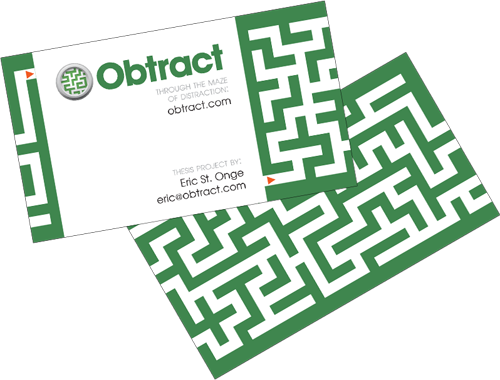
I incorporated the concept into a business card, where a maze ran over the entire surface of the card. The card was printed and used as a takeaway at the thesis festival show.
Copyright © 2010 - 2011 Eric St. Onge
Please send questions or comments to eric at ericstonge dot com.