Eric St. Onge
Note
This page is adapted from two entries I wrote for FiftyThree's blog: Prototyping Paper on iPhone, Part I and Prototyping Paper on iPhone, Part II. Paper for iPhone was very much a team effort, and on this page I'm focusing primarily on my contributions.
Summary
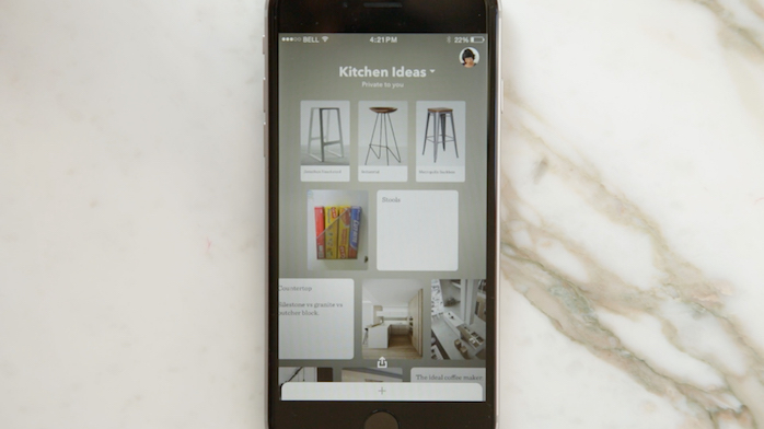
Paper for iPad was released in Spring of 2012. Two years later, FiftyThree's attention finally turned to designing and developing a version of Paper for the smaller-screened iPhone.
There were many challenges and questions involved in making Paper for iPhone, including:
- Would drawing still work on iPhone?
- Would the rich gestures of Paper on iPad work on an iPhone?
- How would we handle the different image shapes and sizes between iPhone and iPad?
Validation Test
Early in the process, a member of our engineering team did a quick port of Paper directly from iPad to iPhone. It was rough, but it was good enough to get started.
Upon investigating the prototype, we determined that we were going to have some big problems if we used Paper for iPad's design directly on the iPhone. Fundamentally, the app would have to be redesigned to work with one finger, and it would have to fit properly on the iPhone's wide screen.
Navigation Exploration
After a brainstorm session with the team, we took a break for everyone to go and build their own prototype of what Paper for iPhone could be. I was tasked with building a "Pocket" version of Paper that would store every image a user had created.
The prototype made liberal use of parallax effects and animations, which have been slowed down so they would be easier to observe. This proposal would have allowed for images of any size to be shown in a grid and had several scrolling views.
Later, the design team took some of the ideas from this prototype and combined them with some of the best ideas from our other prototypes to form a final proposal.
Simplifying Gestures
As the design progressed, we wanted to get an outside look at our proposal. I had primarily been working on the design of canvas interactions, focusing on how users would interact with the tool tray, change brush types, etc.
However, one of the key interactions in Paper for iPad is the "pinch to close" gesture. You could pinch to effectively go "back" from one view to another. On iPad, it was also the exclusive way that users would be able to exit from the image canvas to the image thumbnail view. Since two-finger gestures can be difficult to use on phones, we needed to find an alternative.
I built three prototypes that allowed us to test alternatives. I worked with a teammate to develop a testing script, and then helped to conduct user testing to see how they performed.
We started with a control proposal. We used the same pinch out gesture we had on iPad. This gesture tested surprisingly poorly. Even users who knew the gesture from iPad struggled to figure it out for iPhone.
A second option was to allow a "swipe down" gesture on the tool tray. This proposal ended up being very undiscoverable. Most users wouldn't try it until we prompted them.
Finally, we tested putting a Done button on the canvas. This button was very prominent, and it tested very well. Ultimately, we used a similar approach in the shipping app.
Putting It All Together
As the process continued, I worked further on the canvas interactions of Paper for iPhone. One of coworkers built a prototype that took a closer look at navigating grids and thumbnails, and I focused on navigating in the canvas. Eventually, we added text and photo features to the design as well.
When both the grid navigation prototype and the canvas navigation prototypes had matured, we decided to bridge the two together as a basis for some more user testing.
The navigation prototype was written in JavaScript, and the canvas prototype was written in native UIKit. I did the development work that allowed the two to work together, so that the navigation could effectively "hand off" its contents to the canvas, and vice versa.
The finished prototype worked very well, and it was a very convincing prototype. Once again, I worked with a teammate to write a testing script, and then helped to conduct all of the user research with the prototypes. Later, we built versions of the prototype that were used for remote user testing on UserTesting.com.
The response to the prototype was positive. We had done several rounds of user testing over the course of the design, and the prototypes made it feel "real" much sooner than it would have otherwise. By the time development had started on the application, the changes we were making were relatively small in scope.
Results
The response to the release version of Paper for iPhone was largely positive. Apple featured it in the App Store several times, including on its "Best Apps of 2016" list. It's currently listed as an "Essential" iPhone and iPad app.